您现在的位置是:网站首页> 编程资料编程资料
详解常用css样式(布局)使用CSS的clip-path属性实现不规则图形的显示使用css实现特殊标志或图形css如何绘制特殊图形的方法示例详解CSS3中常用的样式【基本文本和字体样式】编程式处理Css样式的示例代码使用CSS伪元素控制连续几个元素的样式方法纯CSS3 gradient属性制作36种漂亮的html网页渐变按钮样式css样式常见图形效果展示的实例代码
 2023-10-17
291人已围观
2023-10-17
291人已围观
简介 这篇文章主要介绍了常用css样式(布局)及CSS常用样式汇编的相关知识,本文给大家介绍的非常详细,对大家的学习或工作具有一定的参考借鉴价值,需要的朋友可以参考下
兼容css3新属性
在css3中,我们可以使用prefixfree.min.js这个插件来自动为css3的相关属性加上兼容浏览器属性,使我们不用为每个css3新属性再加上属性(需要用到大量css3的项目时再引入)
content布局
当h5内嵌在app里面的时候,在iso手机下,底部(头部)固定按钮会跟着一起滚动,需要使用content布局,然后使用padding-bottom或者padding-top,把相应的位置空出来!!!
当需要在content里面滚动的时候,需要将body和html设置height:100%;然后content也需要设置height:100%,这样才可以实现在content里面里面滚动,当需要在body里面滚动的时候,需要将html、body中的height:100%;设置去掉!!不然body会被限制住,内容只显示一半不能滚动!!!
还有一种解决弹窗遮罩层底部出现滚动的方法就是,当出现弹窗的时候,通过js控制底下的内容为body{height:100%;overflow:hidden;},然后关闭弹窗的时候移除掉这个样式!!!
.content { padding-top: .88rem; -webkit-box-sizing: border-box; -moz-box-sizing: border-box; box-sizing: border-box; max-width: 750px; width: 100%; margin: 0 auto; overflow-x: hidden; height: 100%; overflow-y: auto; -webkit-overflow-scrolling: touch;使用这种布局方式可以解决,单页面滚动的时候,点击弹窗,弹窗会被遮住滚动问题!!!
注意:当需要计算body的高度的时候,不能使用,还有当页面中,有表单,需要使用position:relative时,来使安卓键盘不被挡住!!!!但是为解决弹窗不滚动问题,可以通过,弹窗的时候,增加content布局,关闭弹窗的是移除content布局!!!
//点击领取 $(".reward-btn").click(function(){ $(".reward-page").wrap(""); $(".insurance-box").show(); $(".dialog2").show(); }); //点击关闭大弹窗按钮 $(".closeDia").click(function(){ $(this).parent().parent().hide(); $(".dialog2").hide(); $(".reward-page").unwrap(""); });场景二:在content布局下,需要给页面设置背景图,可以在content下面在包裹一层大的div,然后对这个div进行全页面背景图设置,这样背景图才会随着内容超出一屏幕而滚动,而不是直接在content这个容器上设置背景图,如果直接在这个容器上设置背景图,那背景图不会滚动!!!
常见头部布局
两边有时候有文字或者图标,但是中间的标题固定居中,大概位置如下,就是内容会变化!!

布局如下
css: .head{ position:relative; width:100%; height:88px; line-height:88px; text-align:center; } .head-left, .head-right{ position:absolute; height:88px; line-height:88px; } .head-left { left:30px; } .head-right { right:30px; }
模拟上拉加载
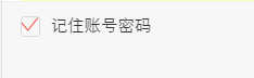
$(window).scroll(function() { var winH = $(window).height(); var scrH = $(window).scrollTop(); var htmH = $(document).height(); //解决滚动到下面,遮罩层一半 $(".fixed").height(htmH); if(winH + scrH >= htmH) { console.info(tabActive); if(tabActive==0){ console.info(1111); if(next_page){ if(ajax_lock == true) { ajax_lock = false; page++; getRecord(page,0); } } } });1.美化复选框
效果
html代码
css代码
.hidden { display: none; } .checkbox:checked ~.icon-checkbox { background: url(../images/yes_15.png) no-repeat; background-size: 0.3rem 0.25rem; } .icon-checkbox { width: 0.3rem; height: 0.3rem; margin-right: 0.1rem; border: 0.02rem solid #d7d7d7; border-radius: 0.06rem; } .icon { display: inline-block; vertical-align: middle; }js
if(!$('#agreeTerm').is(":checked")){ $.alert('请勾选同意《保险条款》和《重要告知与申明》'); return; }; .allCheck { padding:0 .1rem 0 .3rem; } .check-icon { display: inline-block; width:1.5rem; padding-left:.5rem; background:url("../../assets/select-no.png")no-repeat left center; background-size:.42rem .42rem ; } .check:checked ~ .check-icon { background:url("../../assets/selected.png")no-repeat left center; background-size:.42rem .42rem ; } 2.模拟单选按钮
类似效果
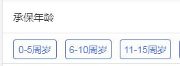
html代码
- 选择补偿金额补偿金说明
css代码
.selection-rd:checked ~ .selection-lb { color: #e44; border:1px solid #e44; } .selection-lb { display: inline-block; margin:33px 30px 30px 0; width:150px; height: 64px; line-height: 64px; white-space: nowrap; background-color: #fff; border:1px solid #bbc; border-radius: 5px; text-align: center; font-size: 32px; }jq代码
var payLevel=$("input[name='money_type']:checked").val();3.中间文字,两边横线居中
效果
代码
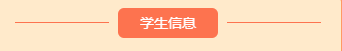
/*中间文字两边横线效果*/ .title-center { position:relative; width:100%; text-align: center; height: 100px; line-height: 100px; font-size: 28px; color: #4d72e2; } .title-center div{ display: inline-block; padding:0 20px; } .title-center:before ,.title-center:after{ display: inline-block; position: relative; content:""; height:2px; width:48px; top:-6px; background-color:#4d72e2; } 当设置rem为单位时,1px,会显示偏大,将.title-center:before ,.title-center:after修改为如下: .title-center:before, .title-center:after { display: inline-block; position: relative; content: ""; height: 1px; width: 1.88rem; top: -.1rem; background-color: #fd734f; -webkit-transform: scaleY(0.5); transform: scaleY(0.5); -webkit-transform-origin: 0 0; transform-origin: 0 0; } 终极版,rem单位,横线自适应长度!!!!学生信息我要居中,两边横线对齐.border-center{ /*display:inline-block; 使用flexchild布局的时候,不能给元素设置这个属性,不然, -webkit-box-flex: 1;会失效*/ height: 1px; background-color: #fd734f; -webkit-transform: scaleY(0.5); transform: scaleY(0.5); -webkit-transform-origin: 0 0; transform-origin: 0 0; }
中间文字,两边横线居中方法2
效果图
不辜负你比较快糖果盒如果好
css
.card-title { padding-top: .4rem; font-size: .34rem; color: #3c3c3c; text-align: center; font-weight: bold; } .card-title .text { position: relative; } .card-title .text:before ,.card-title .text:after { content: ""; display: inline-block; position: absolute; width: .4rem; height: .32rem; background: url('../images/card-title.png')no-repeat; background-size: 100% 100%; top: 50%; margin-top: -.16rem; } .card-title .text:before{ left: -.51rem; } .card-title .text:after{ transform: rotateY(180deg); -webkit-transform: rotateY(180deg); right: -.51rem; }4.怎么实现图标水平垂直居中(rem单位)
利用background-size来设置背景图的本身大小尺寸,然后利用background-position:center center;来设置背景图相对元素的水平垂直居中,其中元素的宽是背景图的宽,高就是原来的高
sass的写法 @mixin headerIcon($width,$height,$url,$position) { position: absolute; $position: .3rem; top: 0; width: $width; //图标的宽度 height: .88rem; //头部的高度 background: url($url) no-repeat; background-position:left center; background-size:$width $height; font-size: .3rem; text-align: left; }方法二,

html: 首页 css: a{display:inline-block;} .foot-nav1{ width: .66rem; height: .66rem; display: block; margin: 0 auto; background:url(); } span { display: block; line-height: .24rem; text-align: center; font-size: .24rem; height: .24rem; margin-bottom: .8rem; color: #666; }
5.头部常用样式设置
.header{ width: 100%; height: .88rem; position: absolute; left: 0; top: 0; z-index: 998; border-bottom: 1px solid #f1f1f1; text-align: center; h1{ font-size: .36rem; font-family: PingFangSC-Medium, sans-serif; } .left-icon{ position: absolute; width: .88rem; height: .88rem; left: .3rem; top: 0; background: url('../../assets/back-icon.png') no-repeat; background-size:.17rem .35rem; background-position: left center; } .right-icon{ position: absolute; width: .88rem; height: .88rem; right: .3rem; top: 0; background: url('../../assets/back-icon.png') no-repeat; background-size:.17rem .35rem; background-position: left center; }6.常用表单布局
效果:
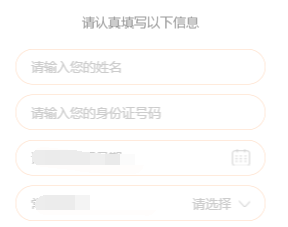
代码:
提示: 本文由神整理自网络,如有侵权请联系本站删除!
本站声明:
1、本站所有资源均来源于互联网,不保证100%完整、不提供任何技术支持;
2、本站所发布的文章以及附件仅限用于学习和研究目的;不得将用于商业或者非法用途;否则由此产生的法律后果,本站概不负责!
相关内容
- 浅析CSS3 用text-overflow解决文字排版问题CSS的writing-mode文字排版属性使用教程css网页布局中文字排版的属性和用法CSS教程:CSS控制网页文字排版实例
- 关于css中margin的值和垂直外边距重叠问题CSS中使用负margin值来调整居中位置CSS中的边界margin的取值为负值说明
- 详解css盒子模型之内边距padding及简写深入理解CSS中的盒子模型CSS盒子模型是什么css盒子模型图解css盒子模型详解加示例CSS3盒子模型详解CSS3盒子模型详解
- button内flex垂直居中竟然不居中的解决Flex布局实现div内部子元素垂直居中的示例css3 flex实现div内容水平垂直居中的几种方法浅谈最全面的水平垂直居中方案与flexbox布局 利用CSS3的flexbox实现水平垂直居中与三列等高布局Flexbox制作CSS布局实现水平垂直居中的简单实例
- CSS3 实现弹跳的小球动画纯CSS3制作的圆形修边渐变按钮动画特效源码css实现鼠标放上去时图片过渡转换动画效果纯CSS3实现的文件夹悬停打开动画特效源码CSS3文字图标组合悬停UI动画特效源码基于css3制作秋天落叶主题动画特效代码
- CSS 3.0文字悬停跳动特效代码CSS3 Calc实现滚动条出现页面不跳动问题HTML+CSS3模拟心的跳动实例代码CSS3实现跳动的动画效果
- css3实现平移效果(transfrom:translate)的示例利用CSS3实现平移动画效果示例代码
- 天天酷跑叉叉助手最新不异常教程攻略_刷金币刷分心得_手机游戏_游戏攻略_
- 天天酷跑金枪小帅葫芦侠刷金币图文教程_刷金币攻略心得_手机游戏_游戏攻略_
- 全民飞机大战超级奖励模式满分技巧_全民飞机大战攻略_手机游戏_游戏攻略_
点击排行
本栏推荐